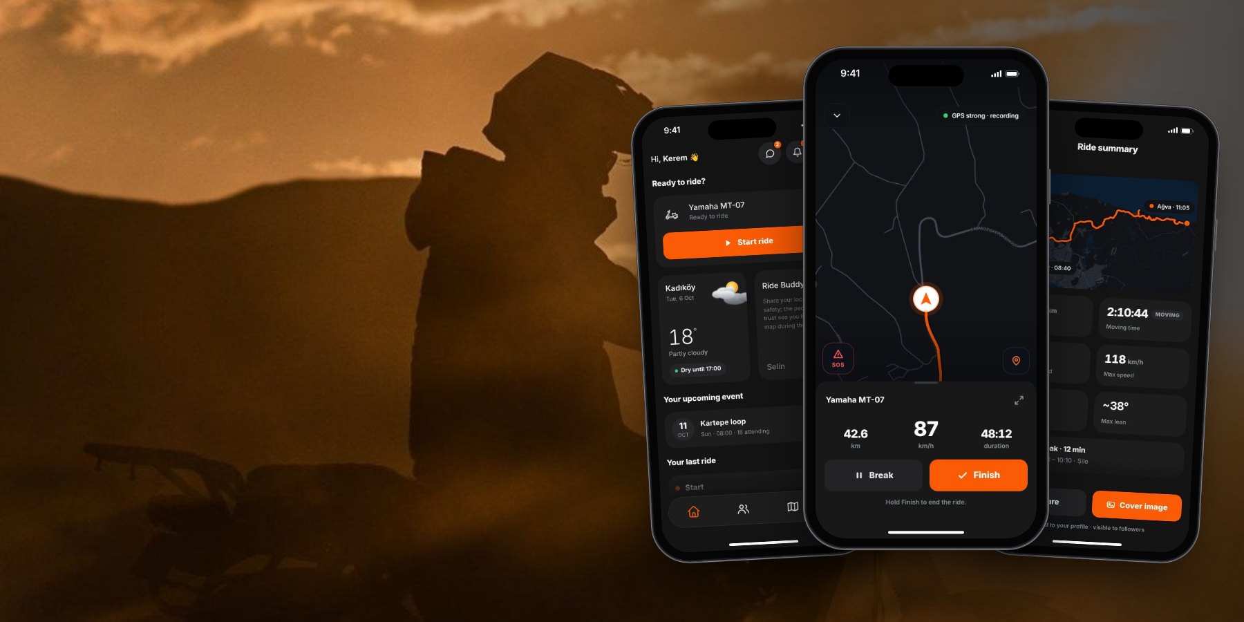
Safety is free. Always.


A ride tracker and community for motorcyclists. Record the ride, tell it in the language of the bike, and never ride alone.
Side project · Designed and built solo · Flutter + Supabase · Live on the App Store · App Store ↗
GOEZ is a ride tracker and community for motorcyclists. I took it from a competitive teardown to a Flutter app now live on the App Store, deciding what the product is, what it refuses to be, and building the system that holds it together.
Riding a motorcycle isn’t an activity. It’s a language.
Corners, lean, pace, the road, the weather that day: it all wants to be told. But no app speaks that language today.
Strava doesn’t accept motorcycles. Moto apps either drop the recording, or draw the route and forget the community, or lock the most needed safety features behind a subscription. So riders bounce between three apps and never feel at home in any of them.
GOEZ records a rider’s ride flawlessly, tells it in the language of the motorcycle, and connects it to a community the moment it’s told.
A screen-by-screen pain and gain benchmark of Strava, REVER, Calimoto and EatSleepRide.
I coded what riders wrote in App Store and Google Play reviews, on Reddit and motorcycle forums, and in independent reviews, in August 2026. I tagged every finding with the app, the screen, pain or gain, and a category, and used the same screen taxonomy for all four apps from onboarding to paywall, so I could compare them side by side. Alongside the desk research I talked to riders I know, and I ride myself.
Strava has no motorcycle activity type, so riders log rides as “E-Bike” and pollute cycling leaderboards. The audience is already improvising.
The top complaint across REVER, Calimoto and EatSleepRide: lost data, crashes when paused, GPS drift and battery drain. One rider reported losing more than 1,000 miles of rides over five years.
It pauses but doesn’t resume. With high speeds and constant stop-and-go, a naive model is a disaster on a motorcycle.
Strava’s stat overlays are hidden, REVER is map-centric, Calimoto and EatSleepRide export nothing. Third-party overlay apps exist only because of this gap.
No user search or follow, group rides in beta for years, no group messaging. Riding together is the main use case, with no tool to coordinate it.
REVER locks Safety SMS and live links in Pro; EatSleepRide’s crash detection is paid, and its reviews are titled things like “False positive. But hey it worked”; one rider reported it missed a real crash.
A rider wants to record a great ride reliably, tell it in the language of the bike and share it with their own community, but can’t do it in one place.
Five jobs, one flow.
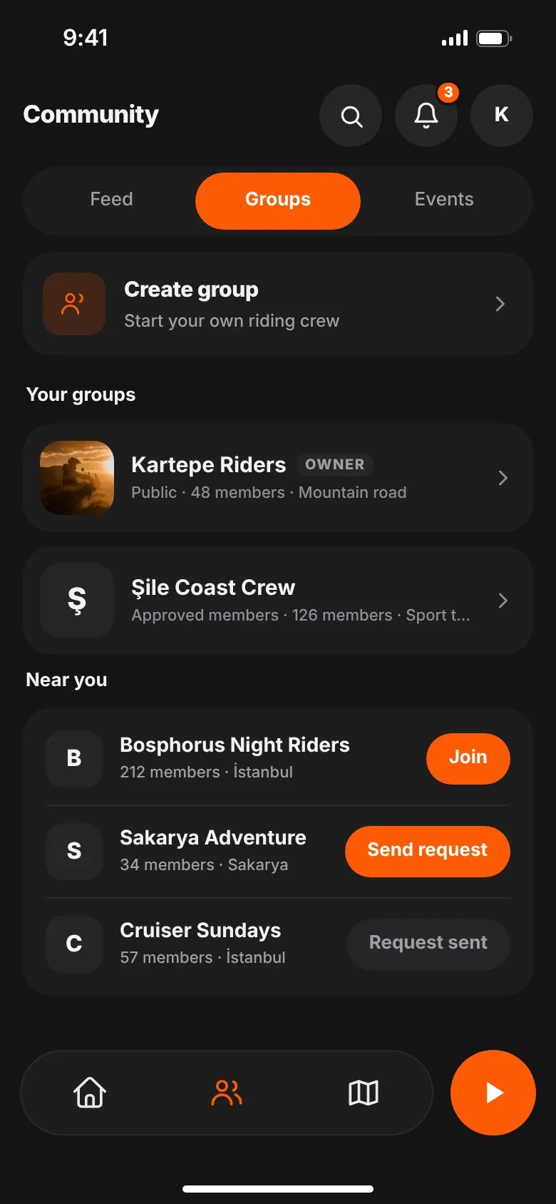
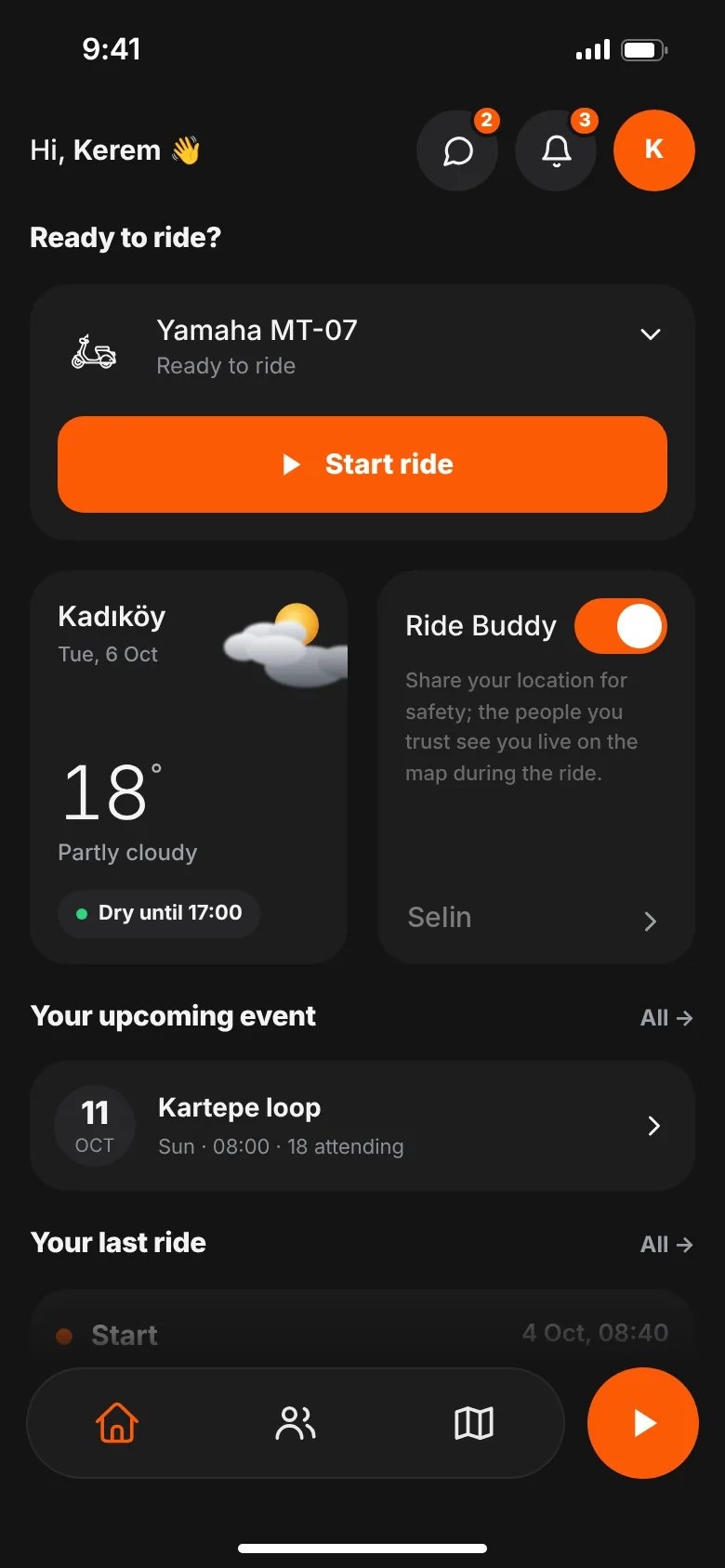
A rule I used as a design filter: if a screen doesn’t serve at least one of these jobs, it has to justify being there. The app has three tabs, Home, Community and Map, with a record button beside them in the tab bar, so a ride is one tap away from anywhere.
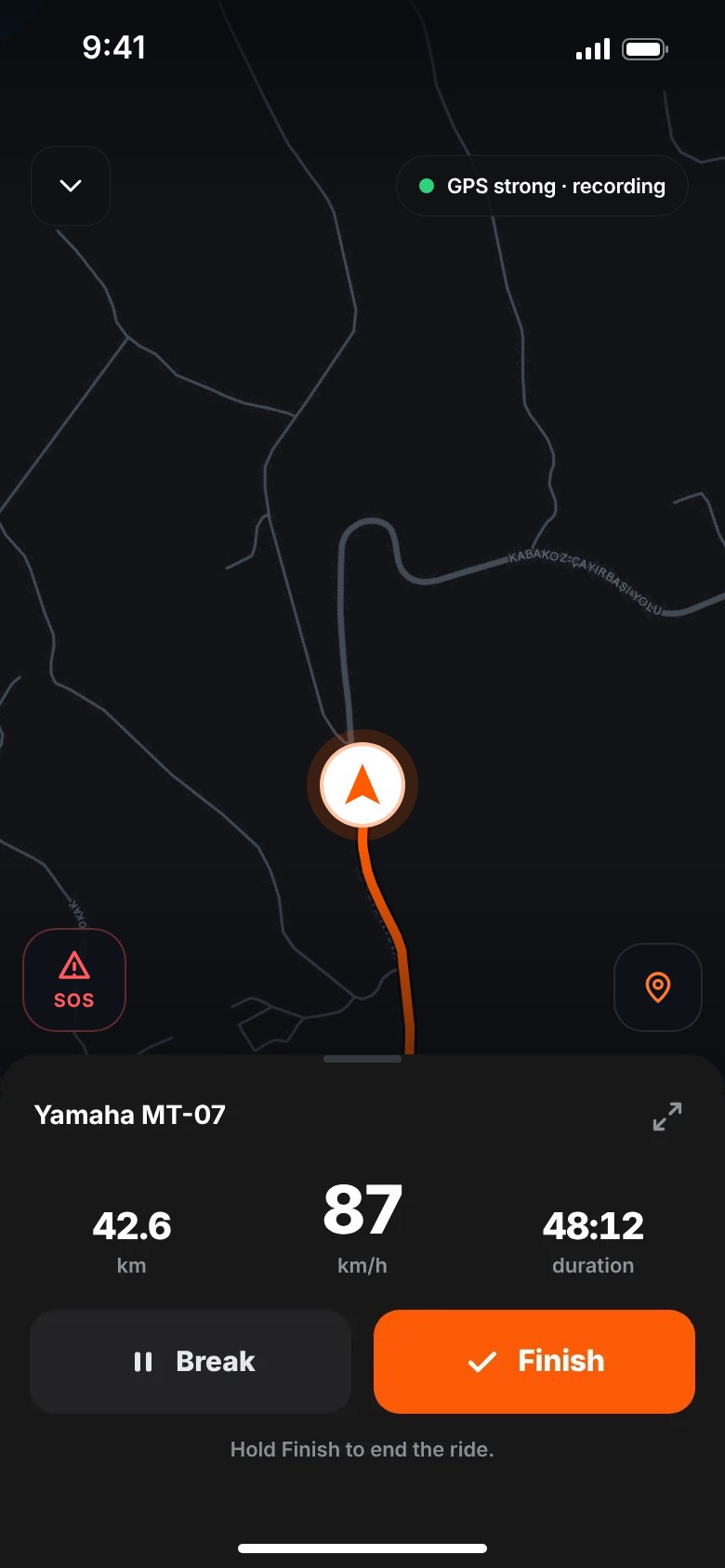
Crash-safe recording: every point is saved on the phone first and syncs once you’re back online. A stop longer than 2 minutes becomes a break by itself.
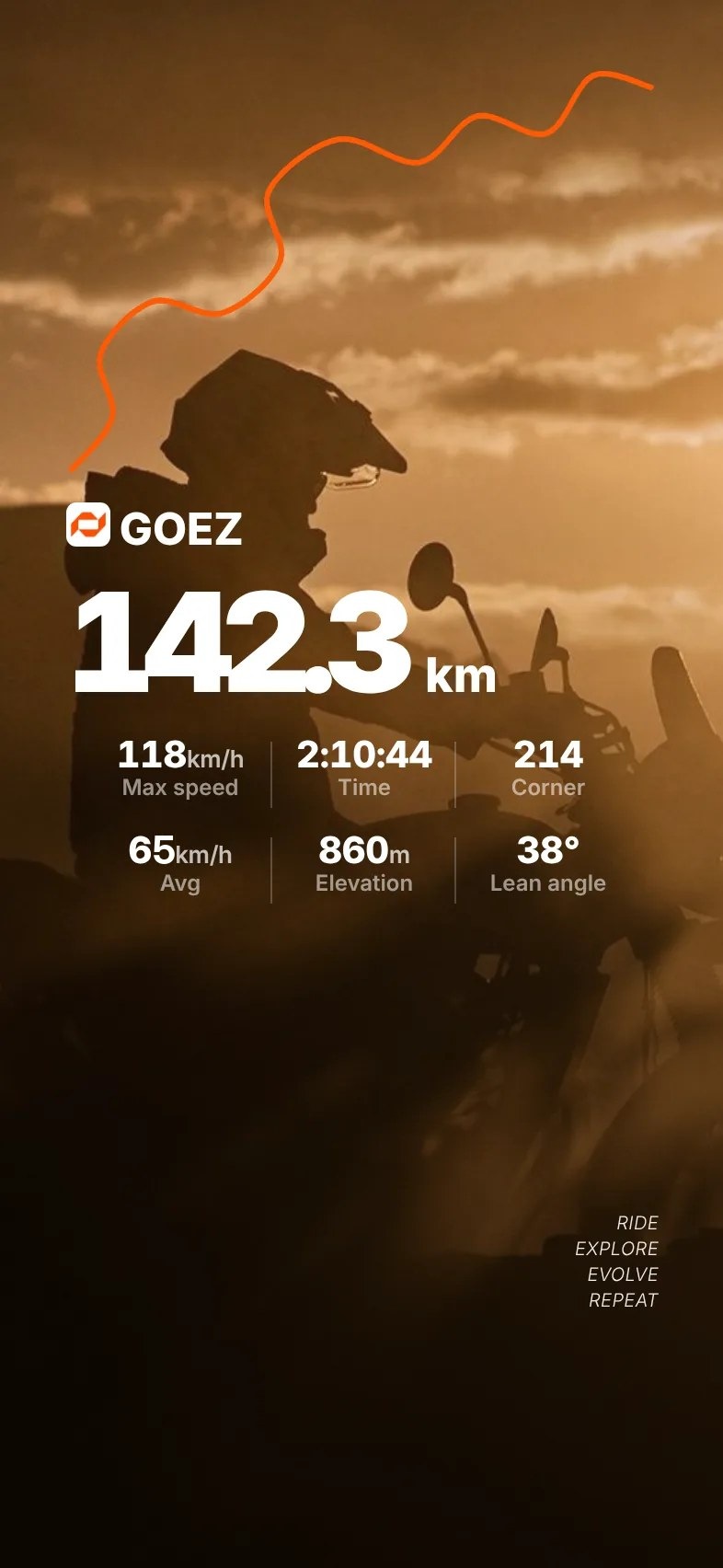
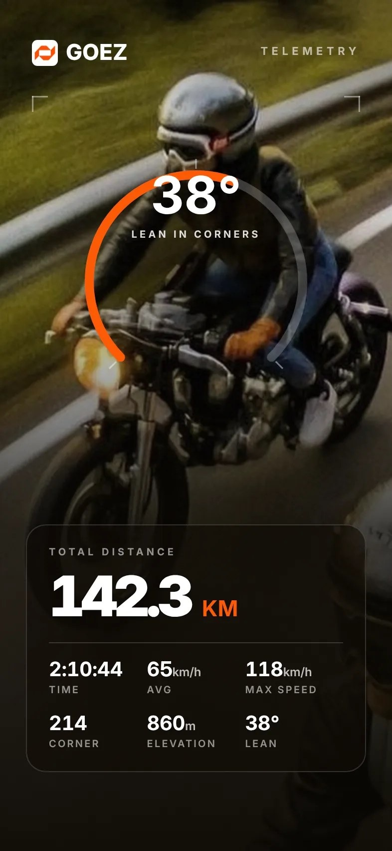
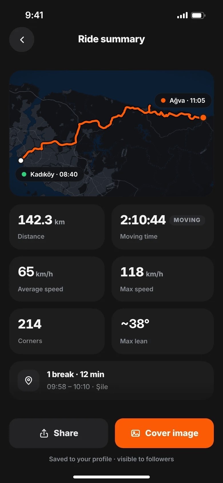
Corner count, estimated lean angle (max, left and right), top and average speed, elevation and breaks.
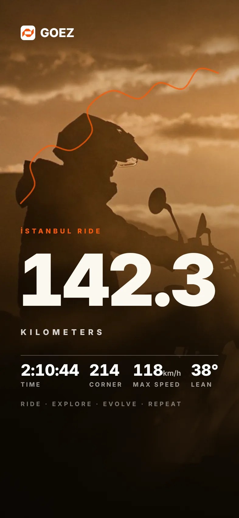
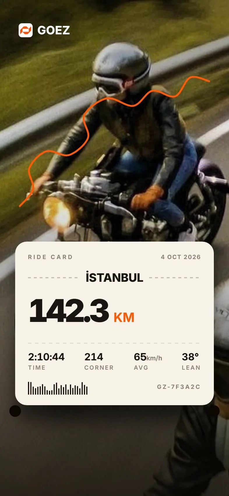
Overlay templates put ride data on your own photo or route, ready for an Instagram Story.
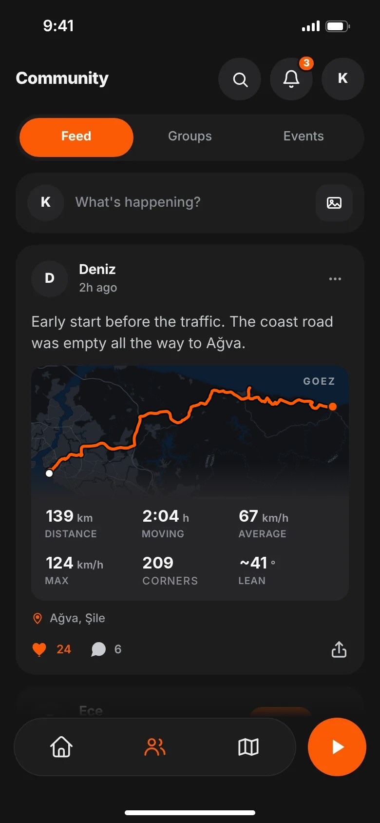
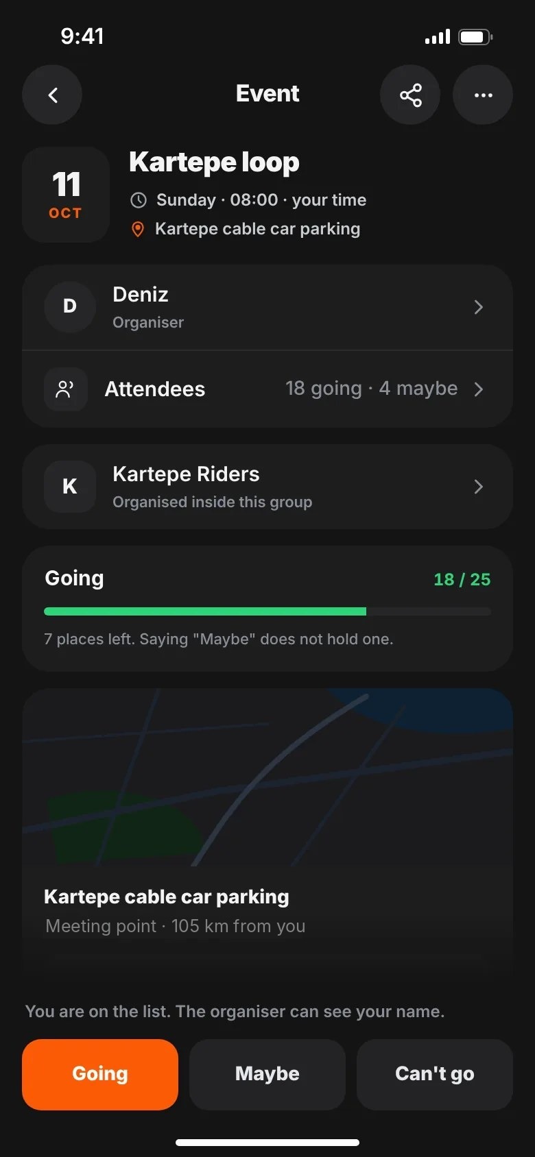
A chronological feed, groups, events and chat, so a ride can be planned without leaving the app.
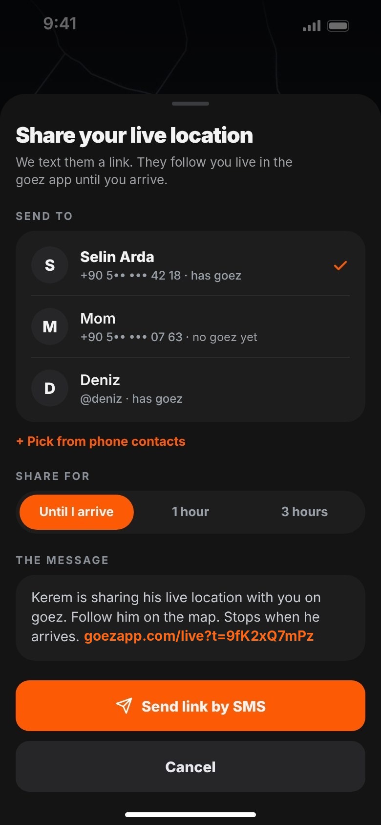
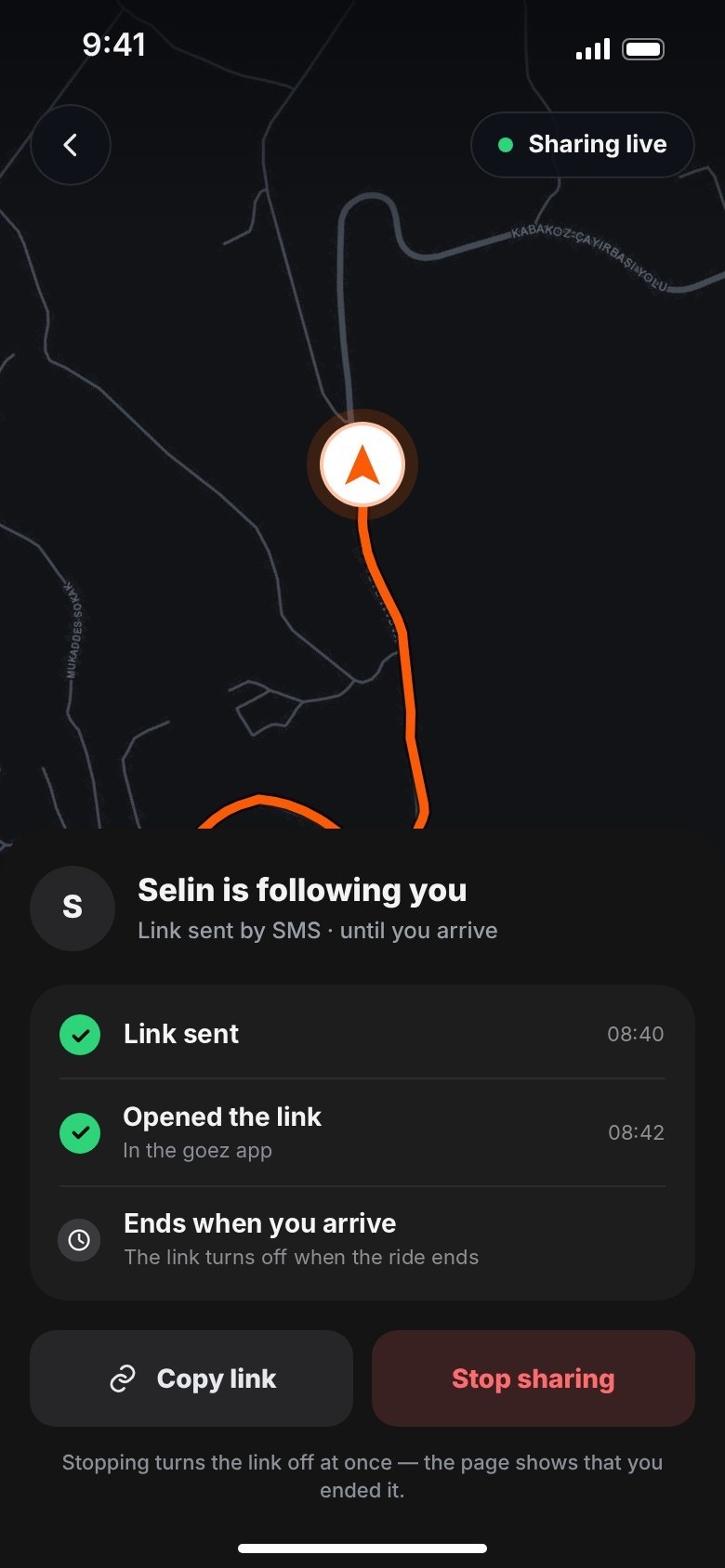
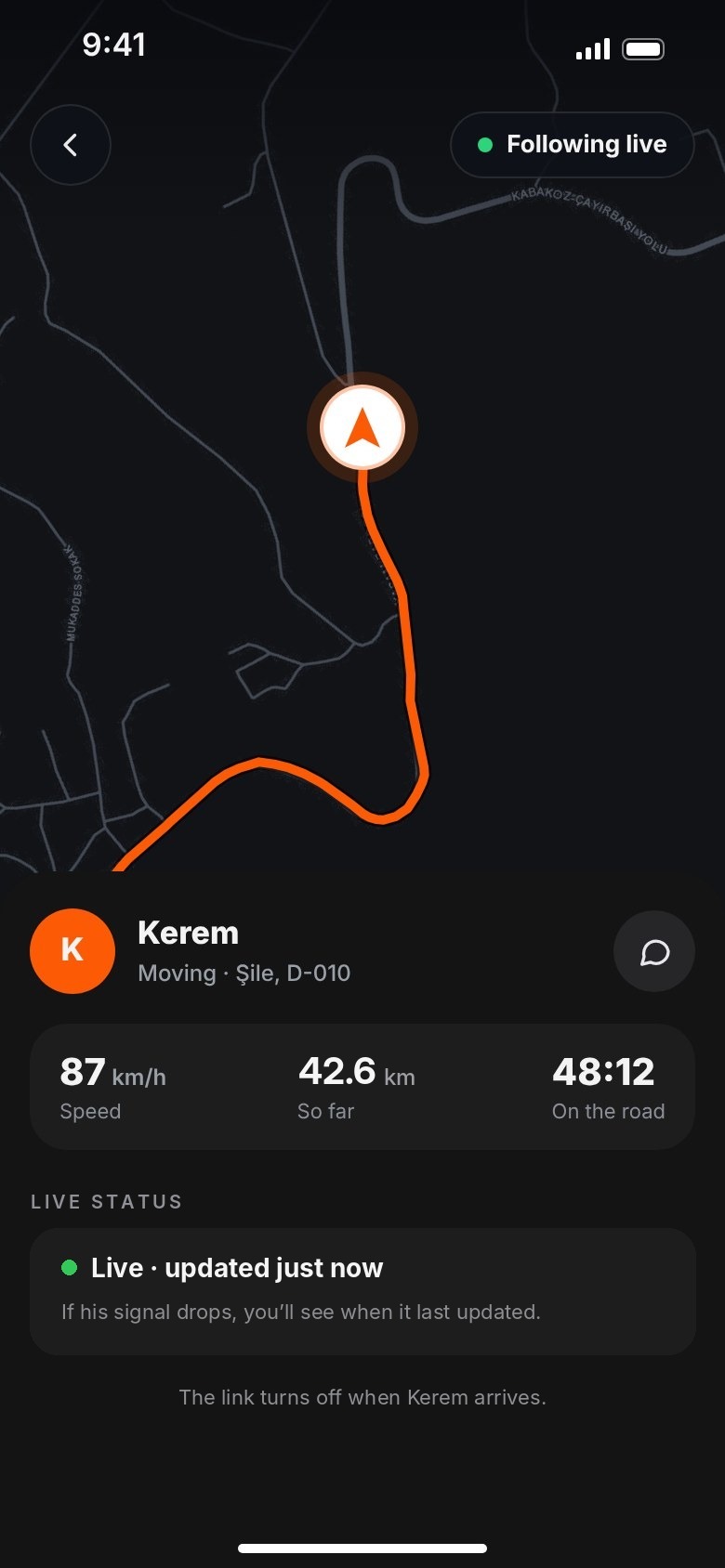
Ride Buddy live location and a hold-to-send SOS with your location, free on every plan.


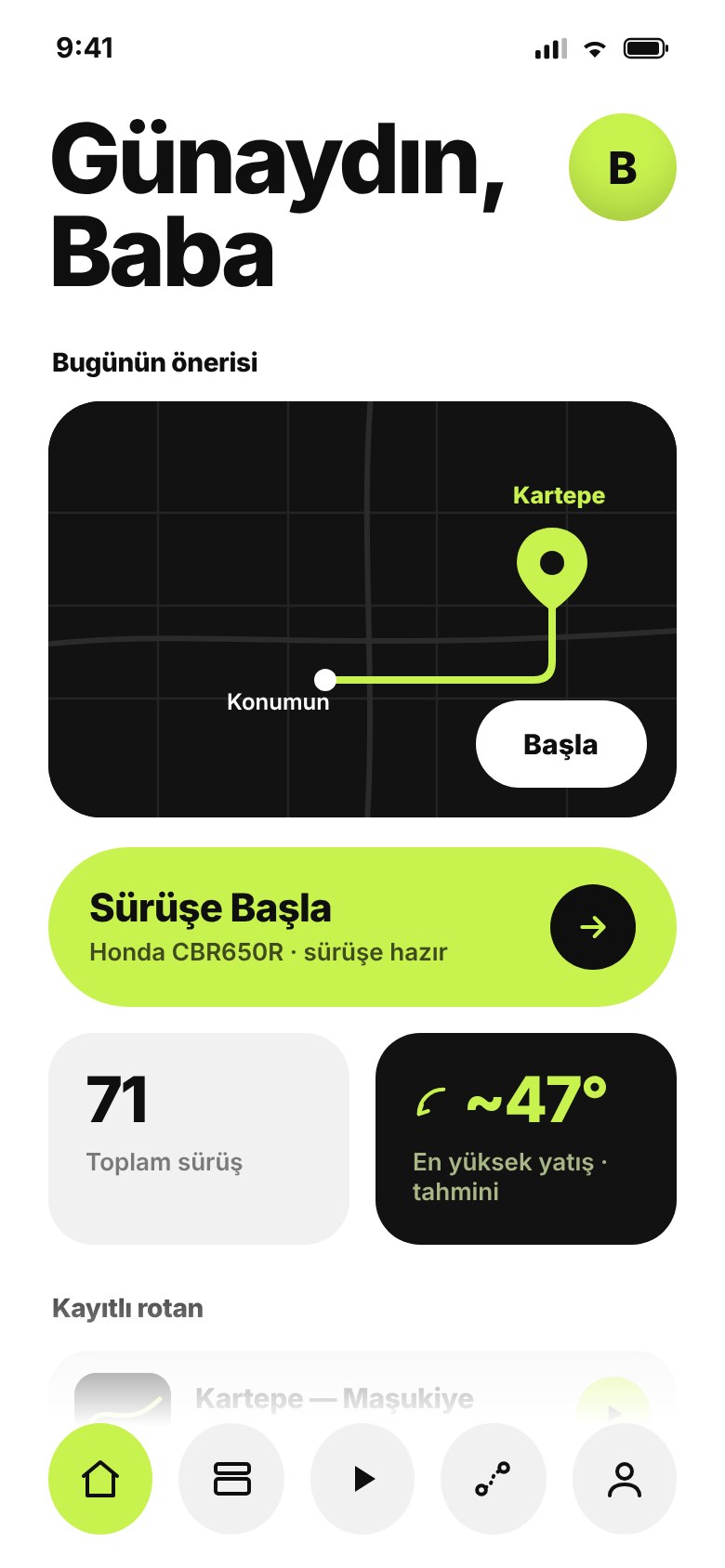
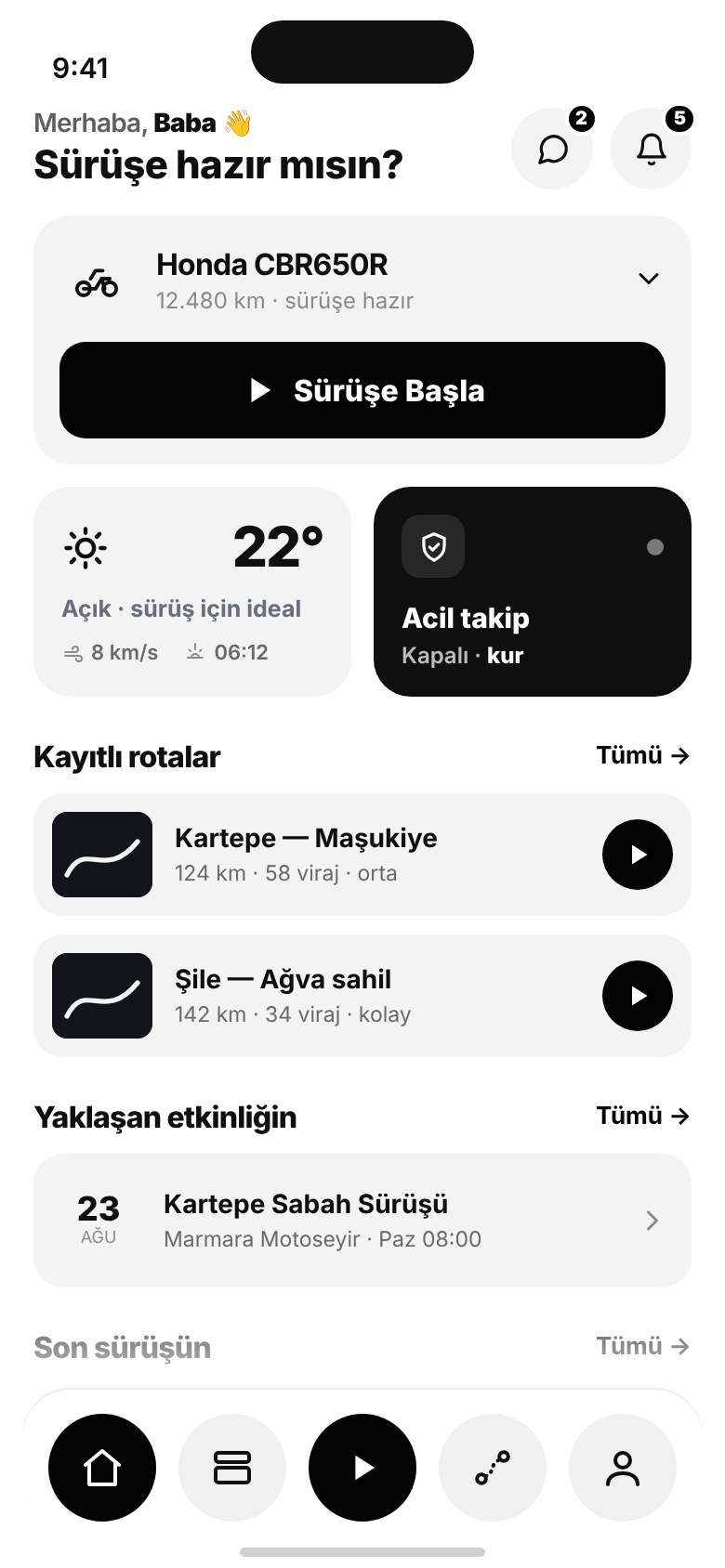
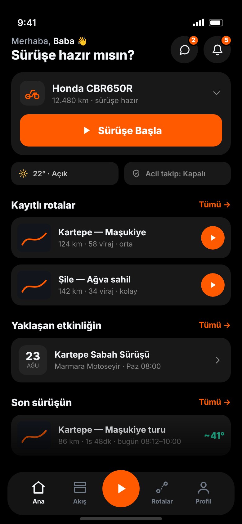
Before the final look, I built the home screen as clickable prototypes in three visual directions.
A neon direction, a black-and-white one and a dark one with a single orange action. I kept the dark one.


I treated every complaint from the research as a problem to design out, not a feature to bolt on.
Three pains that came up again and again in the benchmark, paraphrased from riders’ reviews, and how I designed each one out. Safety, sharing and community are covered in the decisions above.
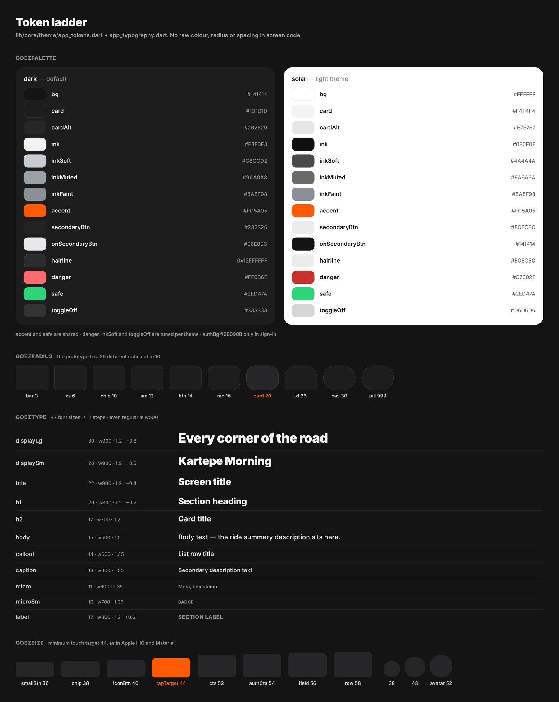
My 42-screen prototype was quick to make and hard to build: it used 26 different corner radii and 47 font sizes.
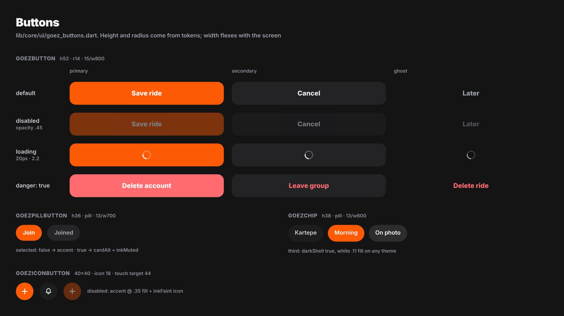
I cut it down to one token ladder: 10 radii, 11 type steps, a 44 pt minimum hit area and two themes, dark and light. I made ride controls bigger: Break and Finish use the 52 pt button, and Finish is hold-to-confirm, so a gloved tap can’t end a ride by accident. I gave the Flutter theme files the same names, so a token in Figma is the same token in code. Shared components and new screens take their colour, radius and spacing from tokens; if a value is missing, I add a token first, and I’m moving the remaining hard-coded values in older screens over to tokens. So I make a design change once and it lands in Figma and the app together.


Before submitting, with no users yet, I tested it two ways: on my own motorcycle, on several real rides, and with a structured review alongside my release checklist.
I tested recording on my own motorcycle over several rides, because a locked screen, a dead zone or a long stop only shows up on a real road. For the review I went through the code and the store listing against Apple’s and Google’s store policies and my release checklist, screen by screen, as a rider would use it. It isn’t user research; that starts with the first riders. I caught six release blockers this way:
Success is riders deleting their other ride apps.
Lossless ride completion rate · share creation after a ride · group event participation · weekly returning riders · battery under 8–12% per hour of recording, the target I set in the requirements.
The Ride Buddy web page, so a link works for anyone without the app. Follower alerts for SOS and long stops, wired to real notifications this time. The Android release.
Test what the phone can really do before polishing the screens that depend on it.
My first prototype showed crash detection and live group tracking working. The feasibility check I ran afterwards cut crash detection from 1.0 and flagged live group tracking as the first thing to go if battery use ran high. I finished the screens before I asked the question.
Motosiklet sürücüleri için sürüş takip uygulaması ve topluluk. Sürüşünü kaydet. Motorun diliyle anlat. Yalnız sürme.
Yan proje · Tek başıma tasarlayıp geliştirdim · Flutter + Supabase · App Store’da yayında · App Store ↗
GOEZ, motosiklet sürücüleri için bir sürüş takip uygulaması ve topluluk. Ürünü bir rakip analizinden App Store’da yayında olan bir Flutter uygulamasına taşıdım; ürünün ne olduğuna, neyi bilerek olmayacağına karar verdim ve bütünü bir arada tutan sistemi kurdum.
Motosiklet sürmek bir aktivite değil. Bir dil.
Virajlar, yatış, tempo, yol, o günün havası: hepsi anlatılmak ister. Ama bugün bu dili konuşan bir uygulama yok.
Strava motosikleti kabul etmiyor. Motosiklet uygulamaları ya kaydı yarıda bırakıyor, ya rotayı çizip topluluğu unutuyor, ya da en çok ihtiyaç duyulan güvenlik özelliklerini aboneliğin arkasına kilitliyor. Sonuçta sürücüler üç uygulama arasında savruluyor ve hiçbirinde kendini evinde hissetmiyor.
GOEZ, motosiklet sürücüsünün sürüşünü kusursuz kaydeden, onu motosikletin diliyle anlatan ve anlattığı anda bir topluluğa bağlayan uygulamadır.
Strava, REVER, Calimoto ve EatSleepRide için ekran ekran bir sorun ve kazanım karşılaştırması.
Ağustos 2026’da sürücülerin App Store ve Google Play yorumlarında, Reddit’te, motosiklet forumlarında ve bağımsız incelemelerde yazdıklarını kodladım. Her bulguyu uygulama, ekran, sorun ya da kazanım ve kategoriyle etiketledim; dört uygulamada da onboarding’den ödeme duvarına aynı ekran sınıflandırmasını kullandım, böylece onları yan yana karşılaştırabildim. Masa başı araştırmanın yanında tanıdığım sürücülerle konuştum; ben de motosiklet kullanıyorum.
Strava’da motosiklet aktivite türü yok; sürücüler sürüşlerini “E-Bike” olarak kaydediyor ve bisiklet sıralamalarını kirletiyor. Kitle şimdiden çözümü kendi uyduruyor.
REVER, Calimoto ve EatSleepRide’daki en yaygın şikâyet: kaybolan veriler, duraklatınca çöken uygulama, GPS sapması ve pil tüketimi. Bir sürücü beş yılda 1.000 milden fazla sürüşünü kaybettiğini yazmış.
Duraklatıyor ama devam ettirmiyor. Yüksek hızlar ve sürekli dur-kalk düşünüldüğünde, saf bir model motosiklette tam bir felaket.
Strava’nın istatistik katmanları gizli, REVER harita odaklı, Calimoto ve EatSleepRide hiçbir şey dışa aktarmıyor. Üçüncü taraf katman uygulamaları tam da bu boşluk yüzünden var.
Kullanıcı arama ya da takip yok, grup sürüşleri yıllardır beta’da, grup mesajlaşması yok. Birlikte sürmek ana kullanım senaryosu, ama onu koordine edecek bir araç yok.
REVER, Güvenlik SMS’i ve canlı konum bağlantılarını Pro’ya kilitliyor; EatSleepRide’ın kaza algılaması ücretli; yorum başlıkları “False positive. But hey it worked” gibi, bir sürücü de gerçek bir kazayı kaçırdığını yazmış.
Sürücü, harika bir sürüşü güvenle kaydetmek, motorun diliyle anlatmak ve kendi topluluğuyla paylaşmak istiyor; ama bunu tek bir yerde yapamıyor.
Beş iş, tek akış.
Tasarım filtresi olarak kullandığım bir kural: Bir ekran bu işlerden en az birine hizmet etmiyorsa, orada olmasını haklı çıkarmak zorunda. Uygulamada üç sekme var: Ana sayfa, Topluluk ve Harita; sekme çubuğunda yanlarında bir kayıt butonu duruyor, böylece sürüş her yerden tek dokunuş uzakta.
Çökmeye dayanıklı kayıt: her nokta önce telefona yazılır, bağlantı gelince eşitlenir. 2 dakikadan uzun bir duruş kendiliğinden mola olur.
Viraj sayısı, tahmini yatış açısı (maksimum, sol ve sağ), en yüksek ve ortalama hız, rakım ve molalar.
Katman şablonları sürüş verisini kendi fotoğrafının ya da rotanın üzerine yerleştirir; Instagram Story için hazır.
Kronolojik akış, gruplar, etkinlikler ve sohbet; bir sürüş uygulamadan çıkmadan planlanır.
Ride Buddy canlı konumu ve konumunu içeren basılı tutarak gönderilen SOS; her planda ücretsiz.


Son görünümden önce ana sayfayı üç görsel yönde tıklanabilir prototipler olarak kurdum.
Neon bir yön, siyah-beyaz bir yön ve tek turuncu aksiyonlu koyu bir yön. Koyu olanı tuttum.


Araştırmadaki her şikâyeti, üstüne bir özellik eklenecek bir şey olarak değil, tasarımla ortadan kaldırılacak bir sorun olarak ele aldım.
Karşılaştırmada tekrar tekrar çıkan üç sorun (sürücü yorumlarından özetlendi) ve her birini tasarımla nasıl ortadan kaldırdığım. Güvenlik, paylaşım ve topluluk yukarıdaki kararlarda.
42 ekranlık prototipimi hızlı yapmıştım ama koda dökmek zordu: 26 farklı köşe yarıçapı ve 47 font boyutu kullanıyordu.
Hepsini tek bir token merdivenine indirdim: 10 radius, 11 tipografi kademesi, 44 pt en küçük dokunma alanı ve koyu ile açık iki tema. Sürüş kontrollerini büyüttüm: Mola ve Bitir 52 pt butonu kullanıyor, Bitir basılı tutarak onaylanıyor; eldivenli bir dokunuş sürüşü yanlışlıkla bitiremiyor. Flutter tema dosyalarına aynı adları verdim; Figma’daki bir token kodda da aynı token. Ortak bileşenler ve yeni ekranlar renk, radius ve boşluğu token’lardan alıyor; bir değer eksikse önce token ekliyorum, eski ekranlarda kalan sabit değerleri de token’lara taşıyorum. Böylece bir tasarım değişikliğini bir kez yapıyorum ve Figma ile uygulamaya birlikte yansıyor.


Göndermeden önce, henüz kullanıcı yokken, iki yolla test ettim: kendi motosikletimde, birkaç gerçek sürüşte ve yayın kontrol listemle birlikte yapılandırılmış bir incelemeyle.
Kaydı kendi motosikletimde birkaç sürüşte test ettim; çünkü kilitli ekran, kapsama dışı bir bölge ya da uzun bir duruş ancak gerçek yolda ortaya çıkar. İnceleme için kodu ve mağaza sayfasını Apple ile Google’ın mağaza politikalarına ve yayın kontrol listeme göre, bir sürücünün kullanacağı gibi ekran ekran gözden geçirdim. Bu bir kullanıcı araştırması değil; o, ilk sürücülerle başlıyor. Bu incelemeyle altı yayın engeli yakaladım:
Başarı, sürücülerin diğer sürüş uygulamalarını silmesidir.
Kayıpsız tamamlanan sürüş oranı · sürüş sonrası paylaşım oluşturma · grup etkinliklerine katılım · haftalık geri dönen sürücüler · gereksinimlerde koyduğum hedef: kayıt sırasında saatte %8–12’nin altında pil.
Uygulaması olmayan herkes için çalışan Ride Buddy web sayfası. SOS ve uzun duruşlar için takipçi uyarıları, bu kez gerçek bildirimlere bağlı. Android sürümü.
Telefonun gerçekte neyi yapabildiğini, ona dayanan ekranları cilalamadan önce test etmek.
İlk prototipim kaza algılamayı ve canlı grup takibini çalışıyormuş gibi gösteriyordu. Sonradan yaptığım yapılabilirlik denetimi kaza algılamayı 1.0’dan çıkardı, canlı grup takibini de pil tüketimi yüksek çıkarsa ilk gidecek özellik olarak işaretledi. Ekranları, bu soruyu sormadan önce bitirmiştim.