Make membership the reason to start, not an interruption.


A self-checkout anyone can finish without asking for help, live in every Decathlon store in Türkiye.
Sole product designer · Decathlon Türkiye · Since late 2024, still evolving
Figures from Decathlon Türkiye’s business reporting, comparing the new flow with the old one.
Create an intuitive, accessible and understandable self-checkout journey for every customer, built on the new brand and UI kit.
The new brand UI kit had to be adopted without breaking a flow people already knew · the existing kiosk hardware stayed, so every screen had to work on the current touchscreen and RFID box, where items are read as they’re dropped in · payment rules for cards, gift cards, instalments and member points, including categories like food and cosmetics that can’t be paid in instalments.
Sole product designer, and I led the project’s process end to end: I ran the research, defined the flow, designed every screen and its states, tested it with customers and reviewed the build before rollout.
Project Manager · Technology Directors from Türkiye and France · Software engineers
I also worked with the self-checkout team at Decathlon’s head office in France: I supported their design process and research, and shared what we learned in Türkiye with the people who needed it.
Customers struggled to use it and needed help.
From the first screen to payment, people met unclear hierarchy, inconsistent controls and a membership step that broke their rhythm. Each type of user struggled differently, and none felt sure they were doing it right.
Any customer finishes checkout with confidence. Build on the new UI kit, turn membership into part of the flow instead of an interruption, and lower the effort from scan to receipt.
Every confused customer pulled a staff member off the floor, so the lane meant to save labour was creating it. Queues built up at peak hours, abandoned checkouts meant lost or delayed sales, and a membership step people skipped left loyalty sign-ups, points and coupons unused.
Business: fewer staff interventions at the kiosk · more checkouts per hour in the fast lane · more membership sign-ups and point redemption to grow the loyalty base · higher gift card and instalment use.
Customer: payment completion · time per checkout · satisfaction score.
Nine findings, four themes.
I watched customers use the kiosks in store, held short interviews with customers and with checkout staff, and read the kiosk and POS data for where checkouts stalled. I grouped the findings into four themes and used them to rank what to fix first.
No visual hierarchy on the main screen, and button sizes and positions changed between steps. People missed key buttons and mis-tapped.
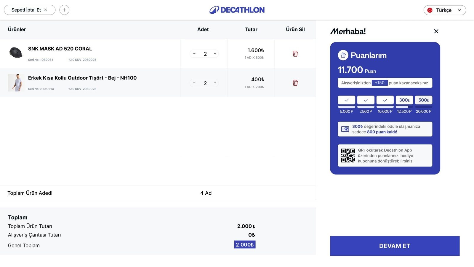
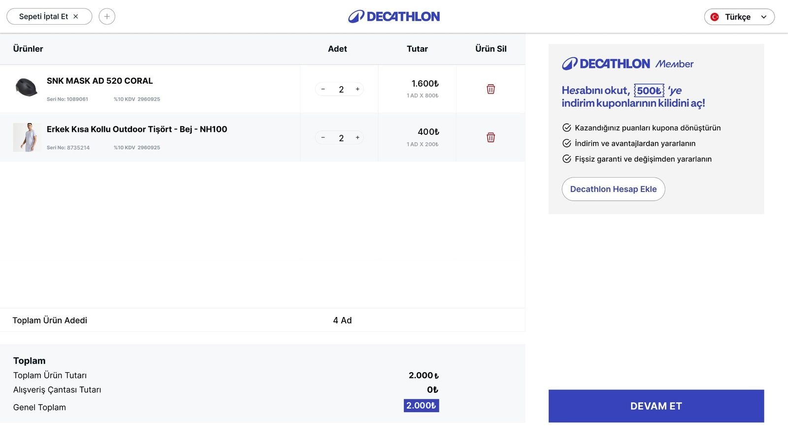
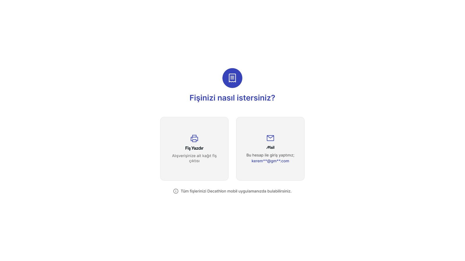
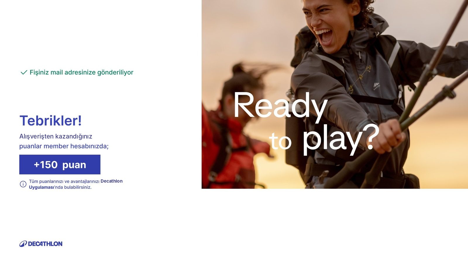
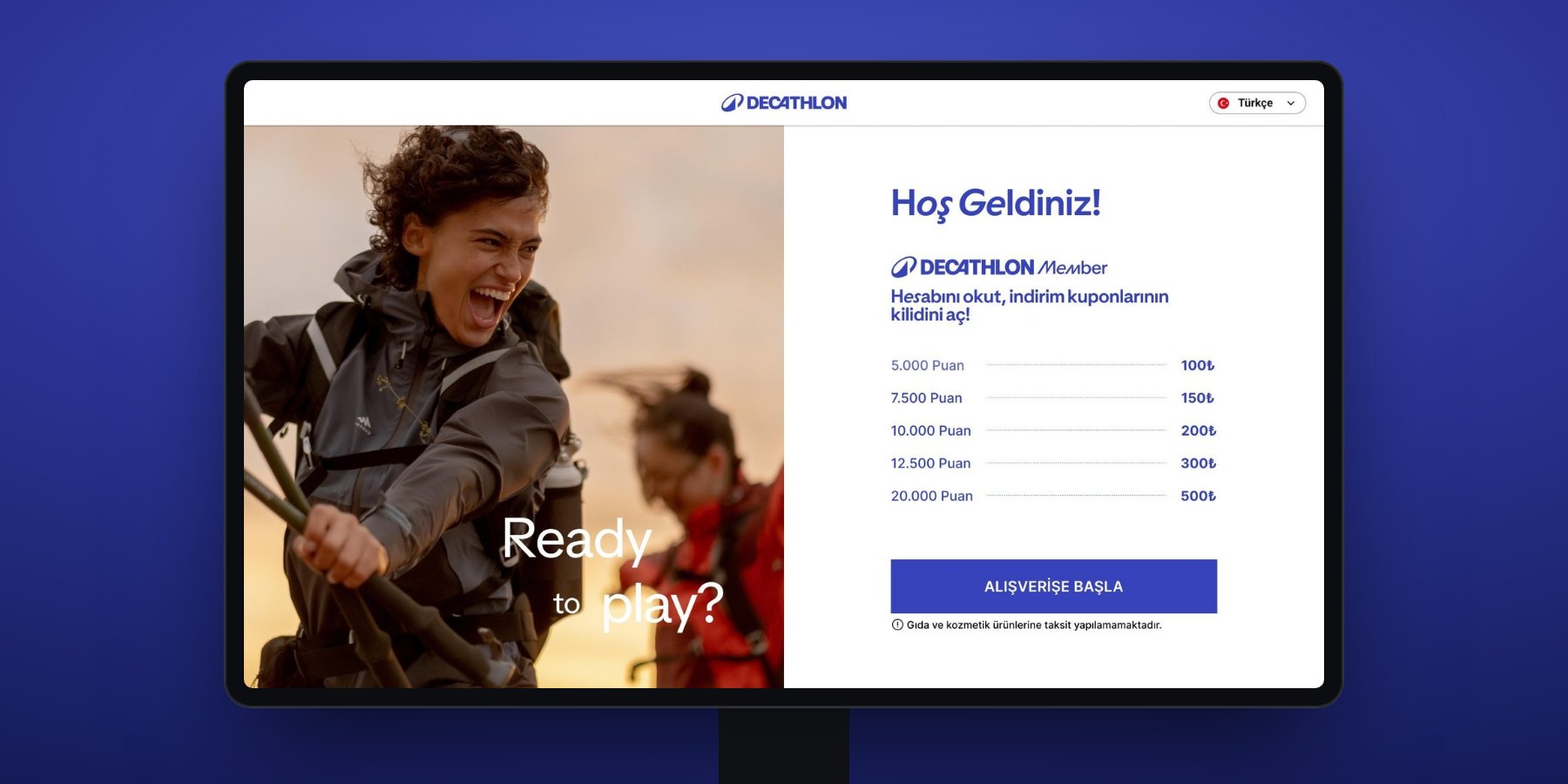
Membership login appeared mid-scan and caused drop-offs. The print-or-email receipt choice came last, without context, and held up the queue.
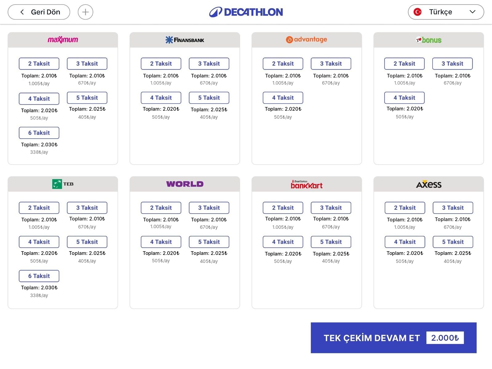
Too many equal-weight payment options caused decision paralysis. Installments and gift cards were buried several levels deep.
Barely any confirmation that an item was read, so people dropped items in twice. Generic payment errors and no first-time guidance meant calling staff.
The key decisions below cover the first three themes. The fourth, weak feedback (findings 05, 08 and 09), was handled in the states and messages I handed over to engineering, described under Handoff.


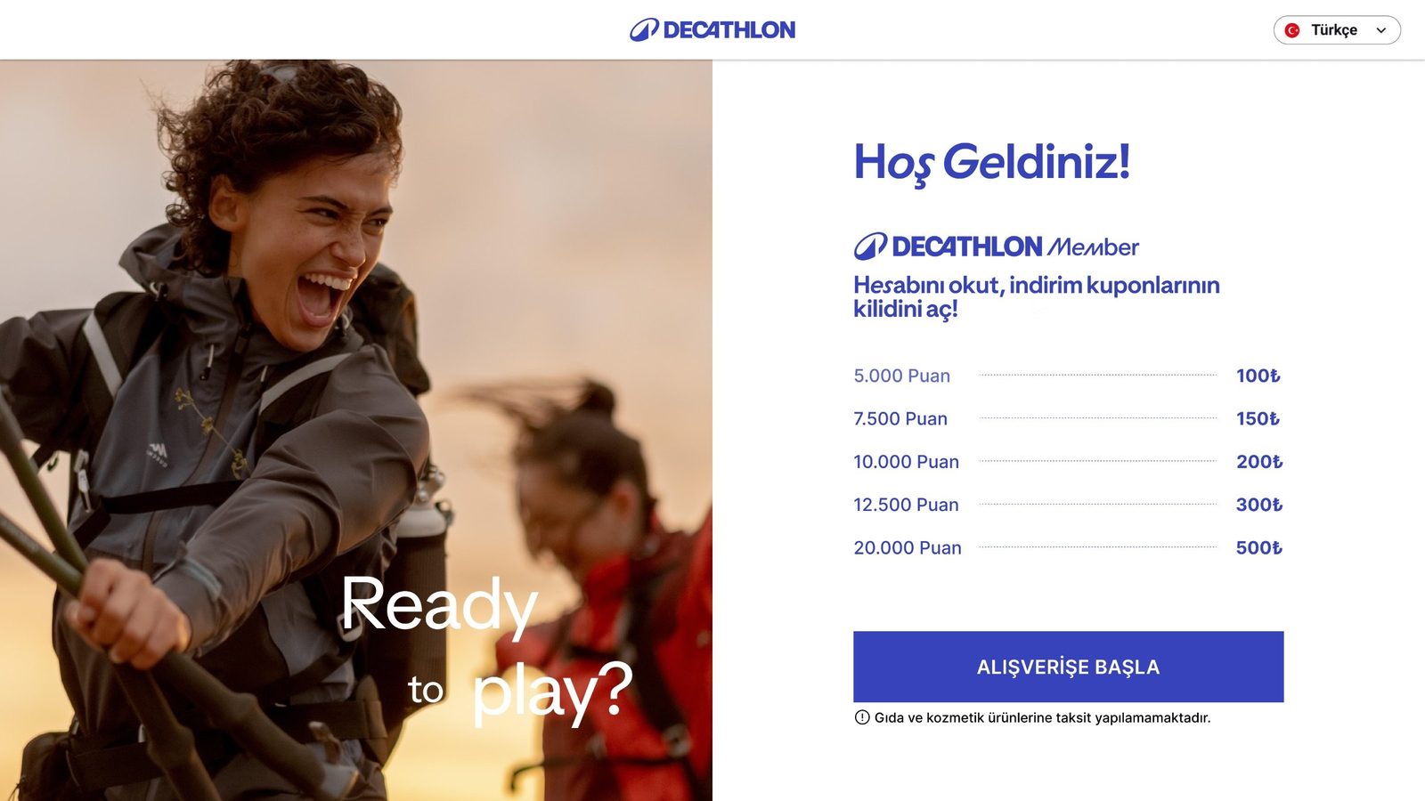
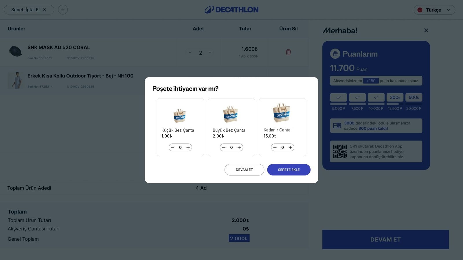
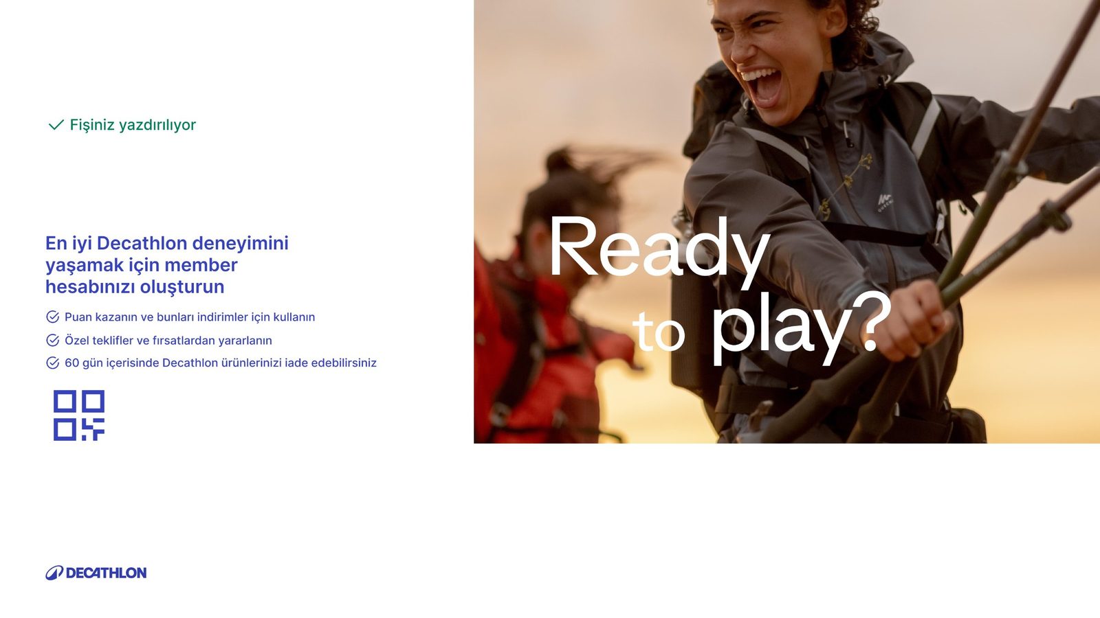
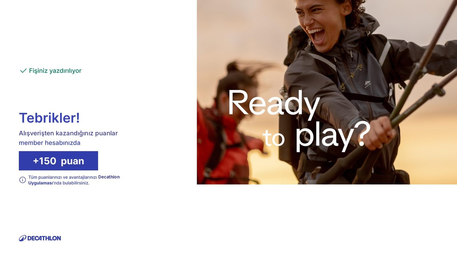
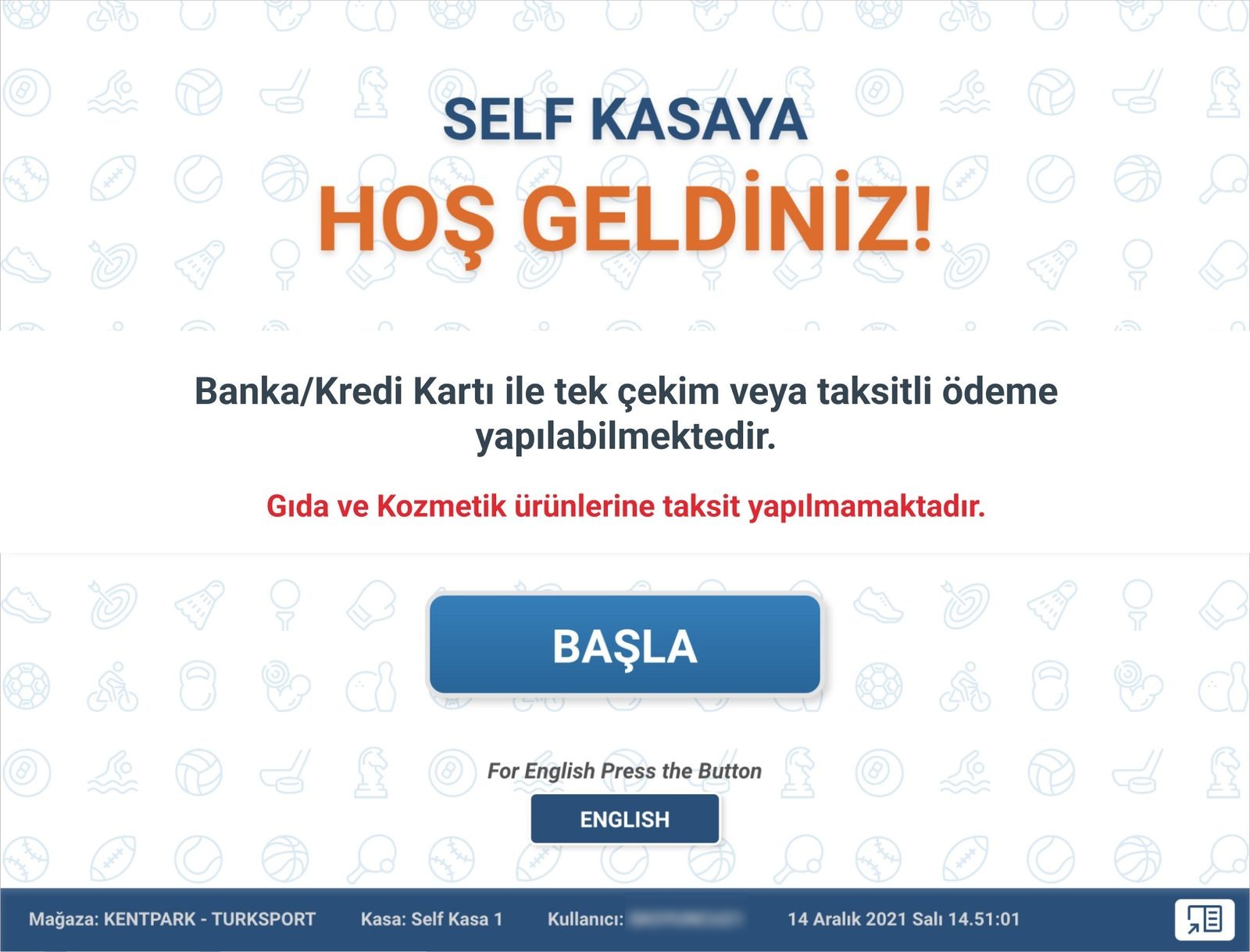
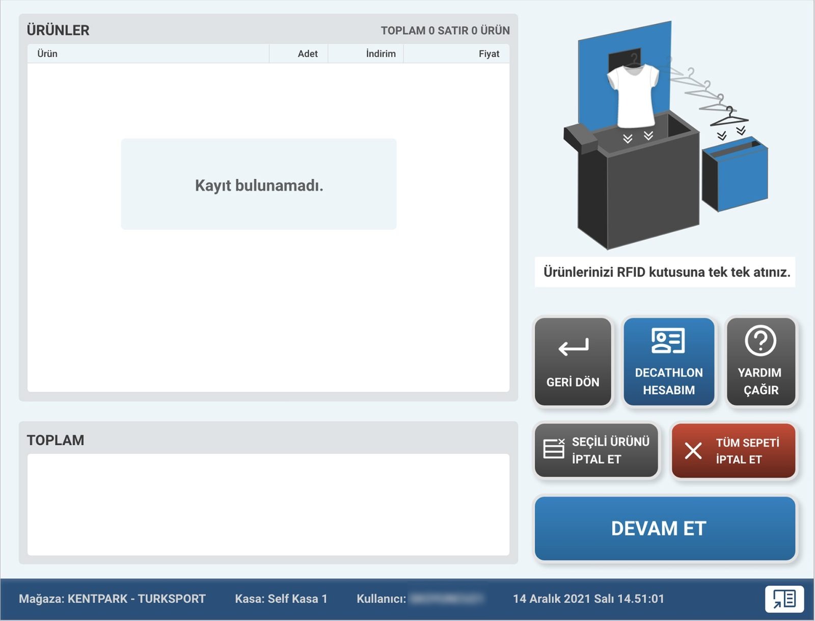
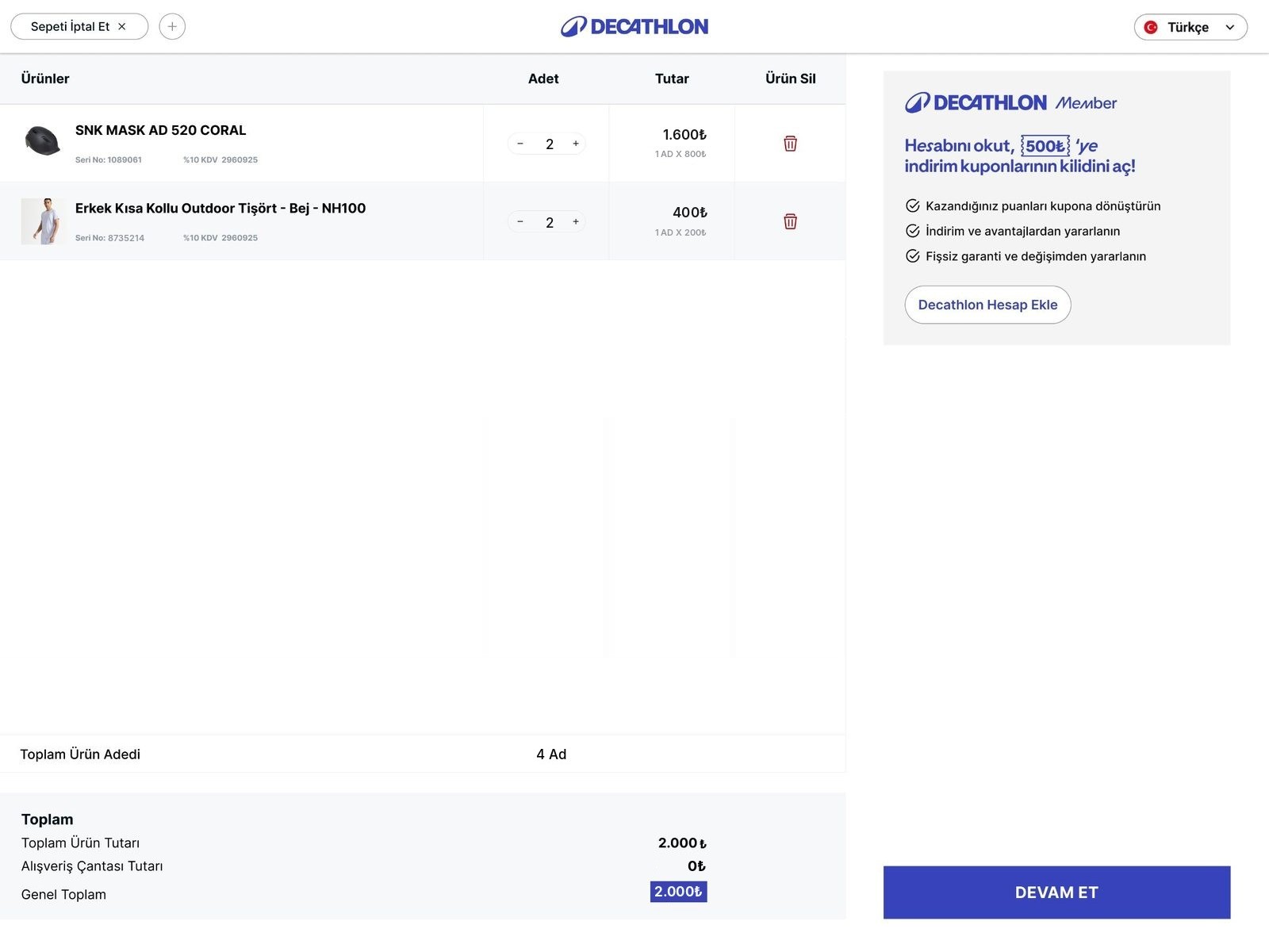
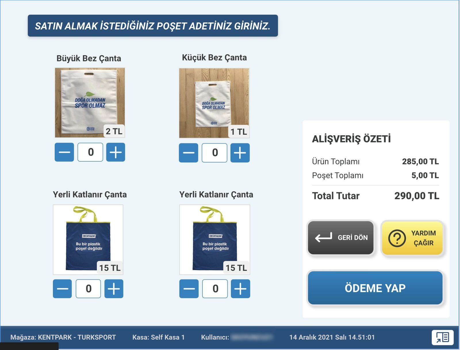
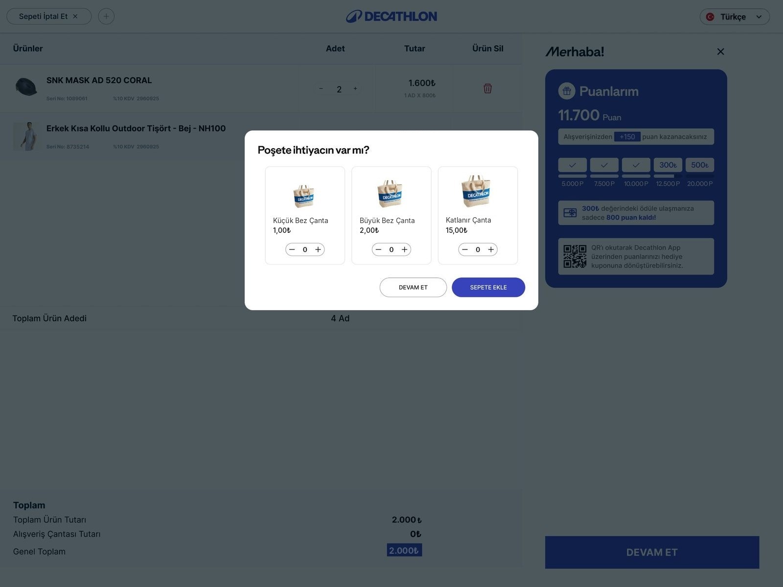
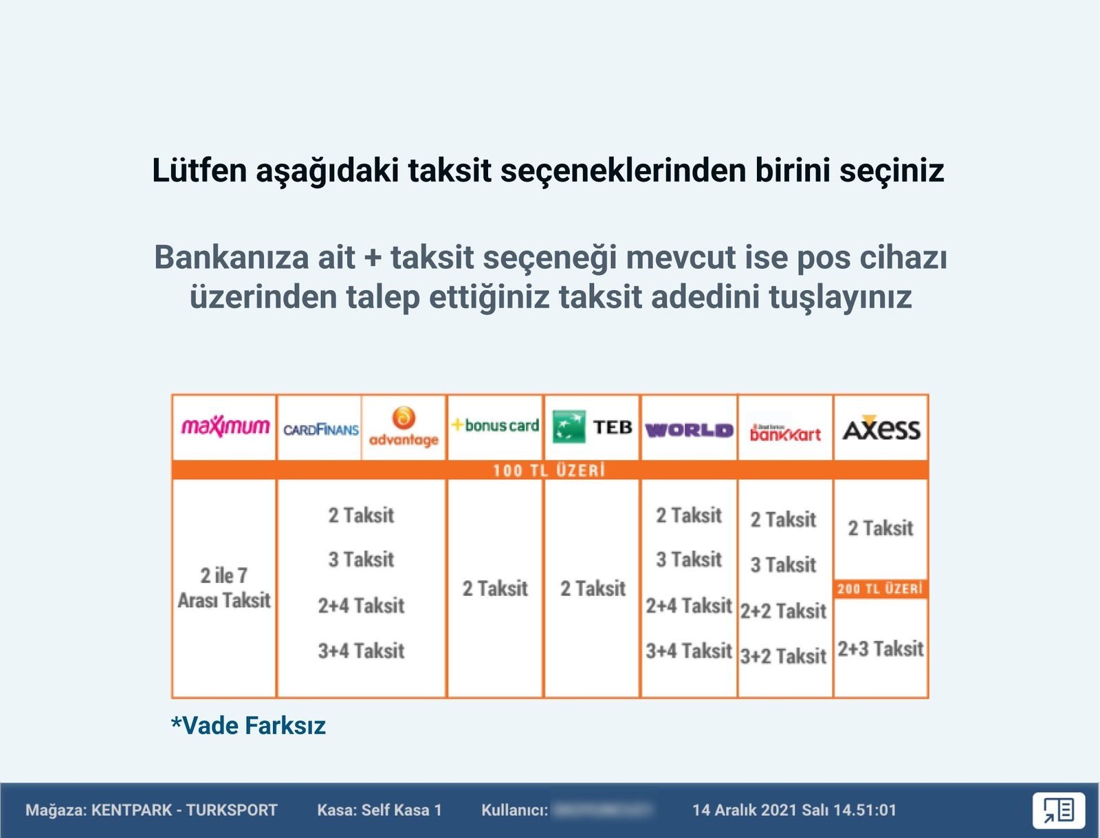
I kept the flow customers already knew and removed the friction inside it. Each legacy screen sits next to its redesign.


Testing ran in a pre-production environment. I held usability sessions with 30 selected customers, then piloted the new flow at Marmara Forum before opening it to every store.
Marmara Forum ran the new flow first. I watched real customers use it in the store, gathered feedback from them and the staff, and fixed what still slowed people down. Only then did it open to every Decathlon store in Türkiye.
Engineers were in the room from the first flows, so technical limits shaped the design instead of cutting it later. I handed over every screen with its states and edge cases, from an item the RFID box can’t read and a declined card to a timed-out session and a basket edited mid-payment, all built on UI kit components so nothing had to be redrawn in code. Before the pilot I reviewed the build on the kiosk itself and signed off each screen against the design.
Designed for someone standing at a kiosk with a basket in hand: large primary buttons with room between them, primary actions within easy reach, high-contrast brand colours, type readable from arm’s length, a language switch in the header of the shopping screens and no step that rushes the customer.
Fewer reasons to call for help.
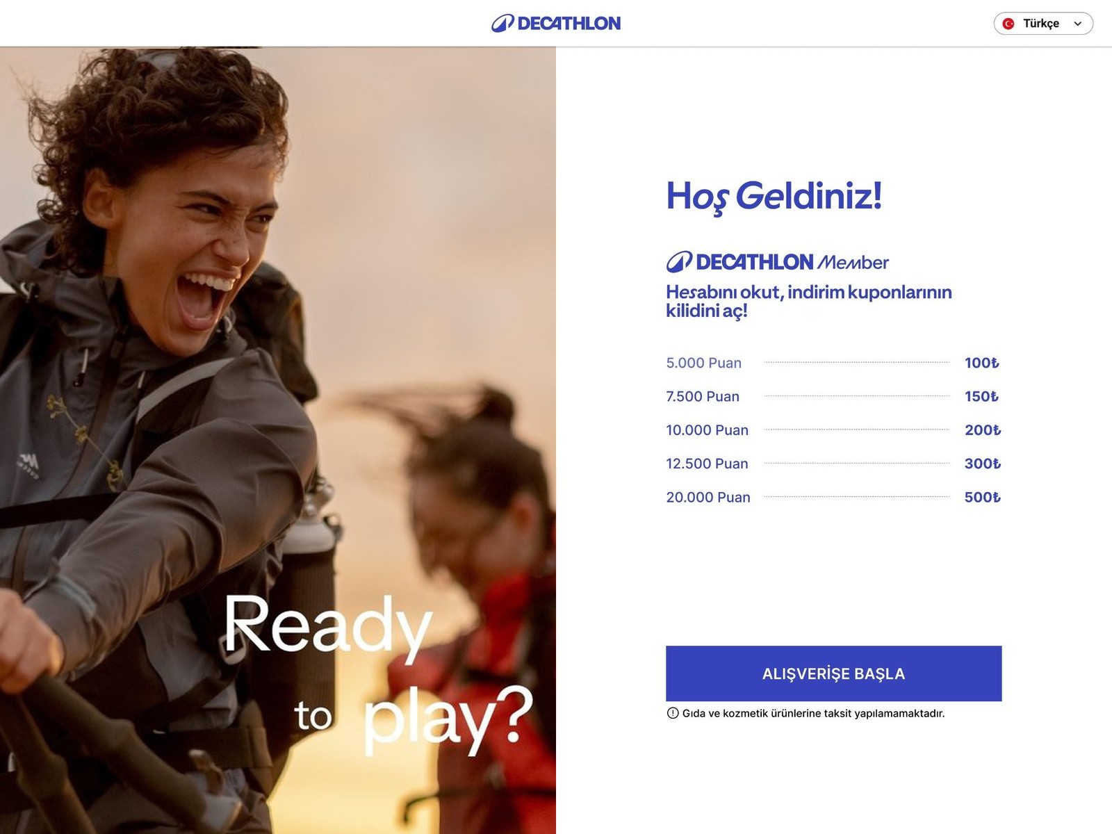
The new flow runs in every Decathlon store in Türkiye. Membership became the reason to start instead of an interruption, payment became one clear choice, and every screen now shares one layout.
The two places the research pointed to first moved the most: membership at the start (+34% sign-ups, +23% point redemption) and the payment step (+43% payment completion, +39% gift card usage).
We didn’t count staff interventions separately, but three signals point the same way: the positive satisfaction survey, feedback from checkout staff, and shorter checkout times.
Kimseden yardım istemeden herkesin tamamlayabildiği bir self checkout deneyimi; bugün Türkiye’deki tüm Decathlon mağazalarında kullanımda.
Tek ürün tasarımcısı · Decathlon Türkiye · 2024 sonundan beri, geliştirmeye devam ediyorum
Rakamlar Decathlon Türkiye iş birimi raporlarından; yeni akışı eskisiyle karşılaştırıyor.
Yeni marka kimliği ve UI kit üzerine kurulu, her müşteri için sezgisel, erişilebilir ve anlaşılır bir self checkout yolculuğu tasarlamak.
Yeni marka UI kit, insanların zaten bildiği akışı bozmadan uygulanmalıydı · mevcut kiosk donanımı değişmedi; her ekran bugünkü dokunmatik ekran ve ürünlerin içine atılınca okunduğu RFID kutusuyla çalışmak zorundaydı · kart, hediye kartı, taksit ve üye puanı için ödeme kuralları; gıda ve kozmetik gibi taksit yapılamayan kategoriler dahil.
Tek ürün tasarımcısıydım ve projenin sürecini uçtan uca ben yönettim: araştırmayı yürüttüm, akışı tanımladım, her ekranı durumlarıyla tasarladım, müşterilerle test ettim ve yayından önce build’i inceledim.
Proje Yöneticisi · Türkiye ve Fransa’dan Teknoloji Direktörleri · Yazılım geliştiriciler
Decathlon’un Fransa’daki merkez ofisindeki self checkout ekibiyle de çalıştım: tasarım süreçlerine ve araştırmalarına destek oldum, Türkiye’deki gelişmeleri ilgili kişilere aktardım.
Müşteriler kullanımda zorluk çekiyor ve yardıma ihtiyaç duyuyordu.
İlk ekrandan ödemeye kadar insanlar belirsiz bir hiyerarşiyle, tutarsız kontrollerle ve ritimlerini bozan bir üyelik adımıyla karşılaşıyordu. Her kullanıcı tipi farklı bir yerde zorlanıyor, hiçbiri doğru yaptığından emin olamıyordu.
Her müşteri ödemeyi güvenle tamamlasın. Yeni UI kit üzerine inşa etmek, üyeliği bir kesinti olmaktan çıkarıp akışın parçası yapmak ve taramadan fişe kadar harcanan çabayı azaltmak.
Kafası karışan her müşteri bir personeli sahadan çekiyordu; iş gücünden tasarruf etmesi gereken kasa, tersine iş yükü yaratıyordu. Yoğun saatlerde kuyruk oluşuyor, yarım kalan ödemeler kaybolan ya da geciken satış demekti; insanların atladığı üyelik adımı yüzünden de sadakat kayıtları, puanlar ve kuponlar kullanılmıyordu.
İş hedefi: kioskta daha az personel müdahalesi · hızlı kasada saatte daha fazla ödeme · sadakat tabanını büyütmek için daha fazla üyelik kaydı ve puan kullanımı · daha yüksek hediye kartı ve taksit kullanımı.
Müşteri: ödeme tamamlama · ödeme başına süre · memnuniyet puanı.
Dokuz bulgu, dört tema.
Müşterilerin kioskları mağazada nasıl kullandığını izledim, müşterilerle ve kasa personeliyle kısa görüşmeler yaptım, ödemelerin nerede takıldığını görmek için kiosk ve POS verilerini inceledim. Bulguları dört temada topladım ve önce neyi düzelteceğimi bunlara göre sıraladım.
Ana ekranda görsel hiyerarşi yoktu; buton boyutları ve konumları adımdan adıma değişiyordu. İnsanlar önemli butonları gözden kaçırıyor, yanlış yere dokunuyordu.
Üyelik girişi taramanın ortasında çıkıyor ve akıştan kopmalara yol açıyordu. Fişi yazdırma ya da e-postayla alma seçimi en sonda, bağlamsız geliyor ve kuyruğu bekletiyordu.
Eşit ağırlıktaki çok sayıda ödeme seçeneği karar felcine yol açıyordu. Taksit ve hediye kartı seçenekleri birkaç katman derine gömülüydü.
Ürünün okunduğuna dair neredeyse hiç onay olmadığı için insanlar ürünleri kutuya iki kez atıyordu. Genel geçer ödeme hataları ve ilk kez kullananlar için yönlendirme eksikliği, personel çağırmak demekti.
Aşağıdaki temel kararlar ilk üç temayı kapsıyor. Dördüncüsü, zayıf geri bildirim (bulgu 05, 08 ve 09), geliştirmeye teslim ettiğim durum ve mesajlarda ele alındı; Geliştirmeye devir bölümünde anlatılıyor.


Müşterilerin zaten bildiği akışı korudum, içindeki sürtünmeyi kaldırdım. Her eski ekran, yeni tasarımıyla yan yana.


Testler preprod ortamında yapıldı. Seçili 30 müşteriyle kullanılabilirlik oturumları yaptım; ardından yeni akışı pilot mağaza olarak seçilen Marmara Forum AVM’de denedim ve sonrasında tüm mağazalara açtık.
Yeni akış ilk olarak Marmara Forum’da devreye girdi. Gerçek müşterilerin mağazada nasıl kullandığını izledim, onlardan ve personelden geri bildirim topladım, insanları hâlâ yavaşlatan noktaları düzelttim. Ancak bundan sonra Türkiye’deki tüm Decathlon mağazalarına açıldı.
Yazılımcılar ilk akışlardan itibaren masadaydı; böylece teknik sınırlar tasarımı sonradan budamak yerine en baştan şekillendirdi. Her ekranı durumları ve uç senaryolarıyla birlikte teslim ettim: RFID kutusunun okuyamadığı ürün, reddedilen kart, zaman aşımına uğrayan oturum, ödeme sırasında değiştirilen sepet. Hepsi UI kit bileşenleri üzerine kuruluydu, kodda hiçbir şeyin yeniden çizilmesi gerekmedi. Pilottan önce build’i kioskun kendisinde inceledim ve her ekranı tasarıma karşı tek tek onayladım.
Elinde sepetle kioskun önünde ayakta duran biri için tasarlandı: aralarında boşluk olan büyük birincil butonlar, kolay erişilen birincil aksiyonlar, yüksek kontrastlı marka renkleri, kol mesafesinden okunabilen yazılar, alışveriş ekranlarının üst kısmında dil seçimi ve müşteriyi aceleye getiren hiçbir adım olmaması.
Yardım çağırmak için daha az sebep.
Yeni akış Türkiye’deki tüm Decathlon mağazalarında kullanımda. Üyelik bir kesinti olmaktan çıkıp başlamak için bir sebebe, ödeme tek ve net bir seçime dönüştü; her ekran artık aynı yerleşimi paylaşıyor.
Araştırmanın ilk işaret ettiği iki yer en çok değişti: başlangıçtaki üyelik (üyelik kayıtlarında +%34, puan kullanımında +%23) ve ödeme adımı (ödeme tamamlamada +%43, hediye kartı kullanımında +%39).
Personel müdahalesini ayrı bir sayaçla ölçmedik; ama üç sinyal aynı yönü gösteriyor: memnuniyet anketindeki olumlu sonuçlar, kasa personelinin geri bildirimi ve kasa işlem sürelerindeki düşüş.